


7
QATAR 2022/BRANDING
12
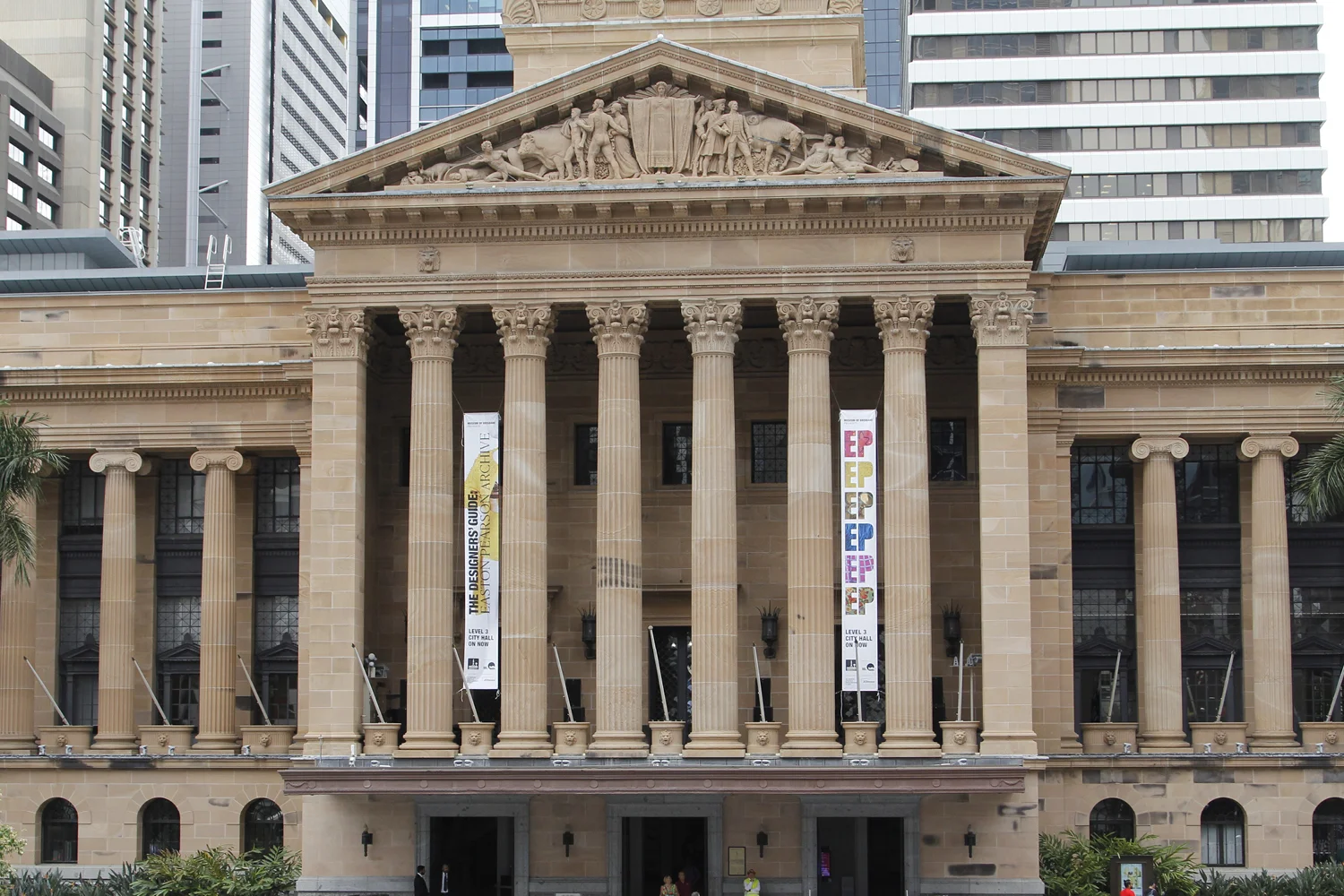
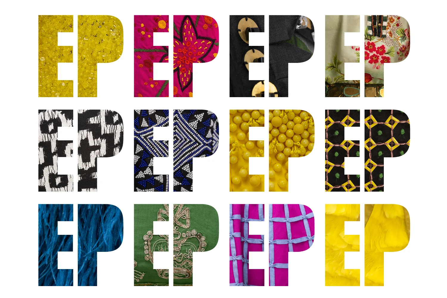
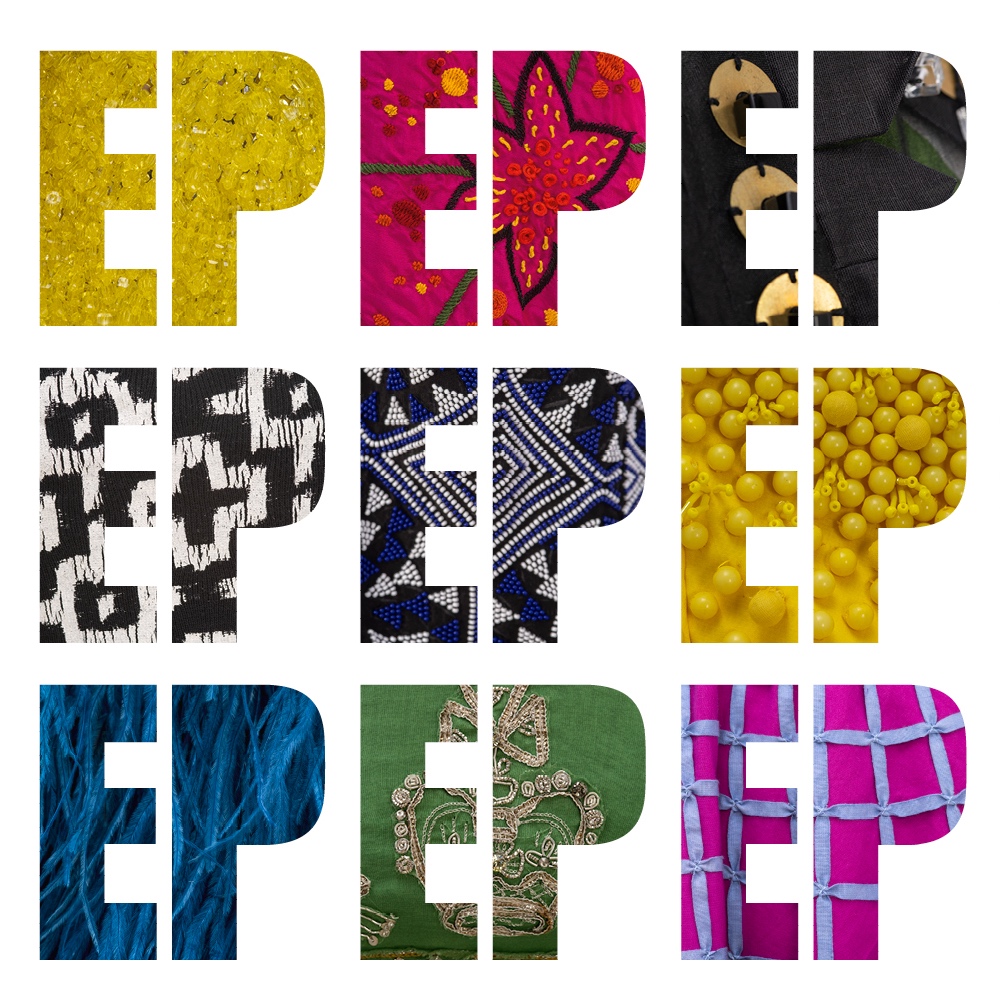
EASTON PEARSON/EXHIBITION BRANDING

9
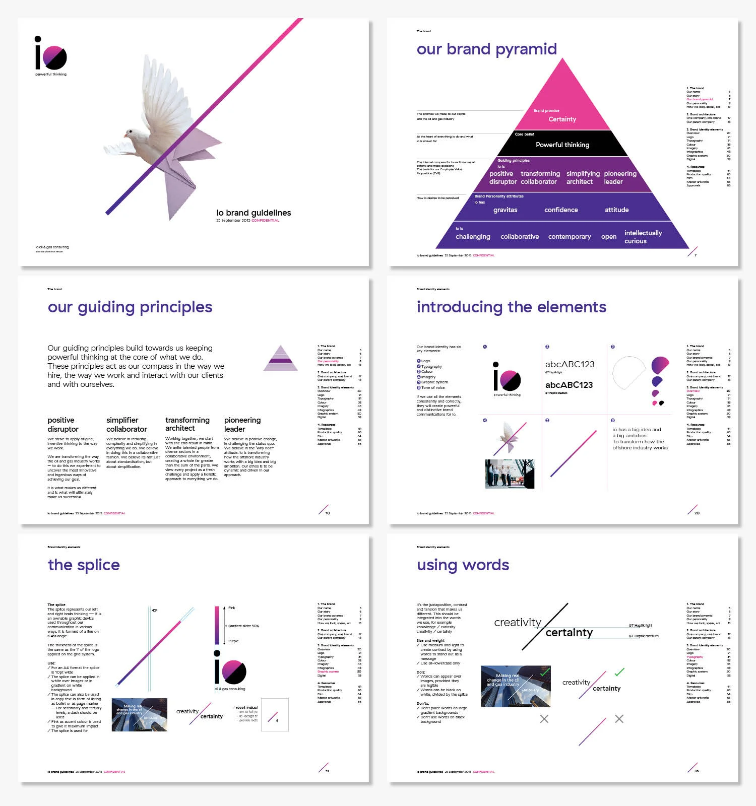
IO/BRAND CREATION

8
APSA/BRAND

7
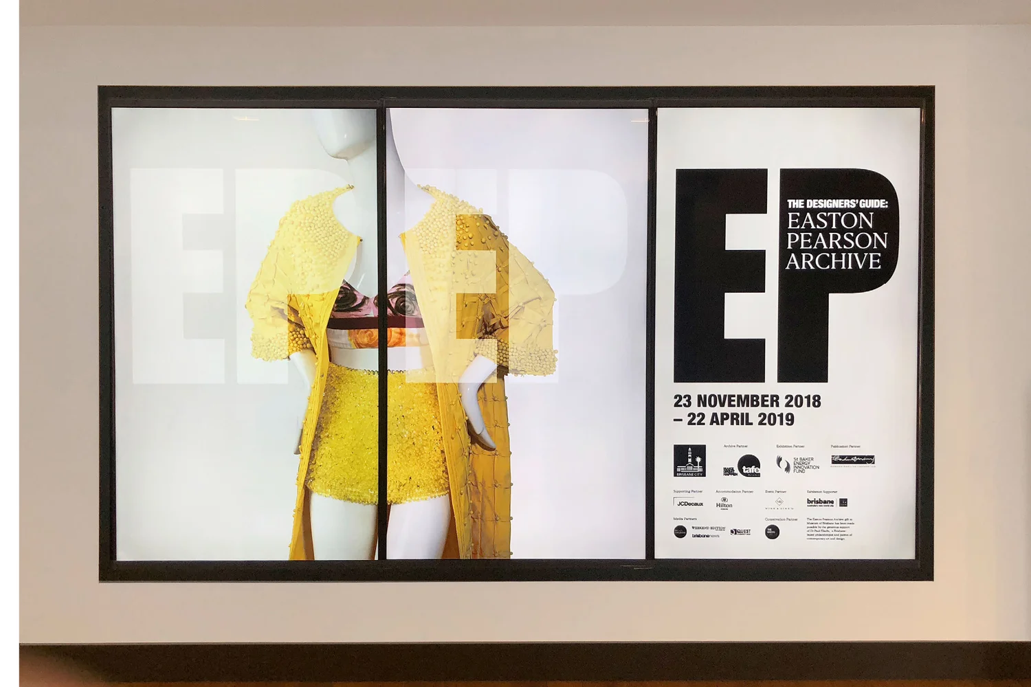
EP/EXHIBITION CATALOGUE

5
AEDILE/IDENTITY

7
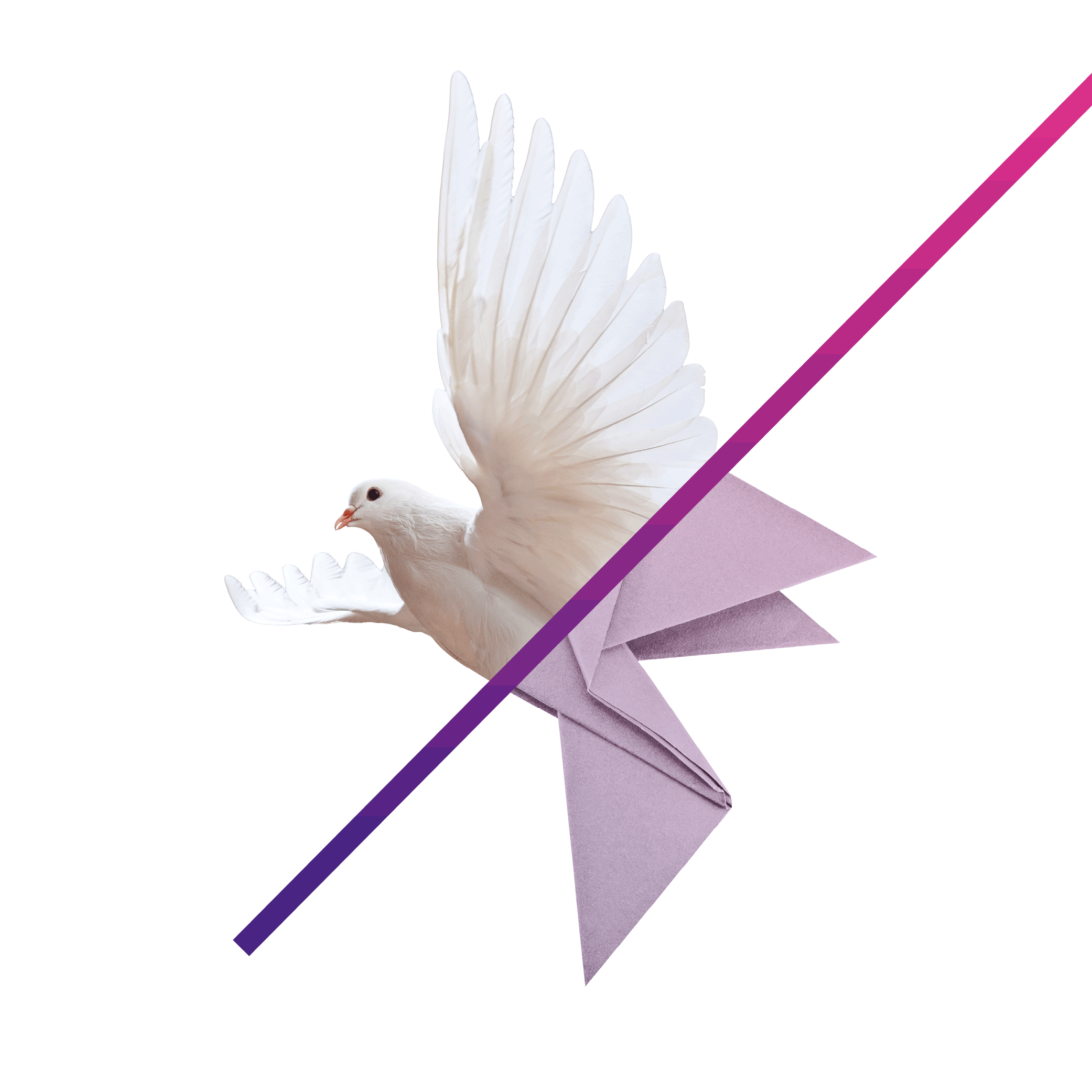
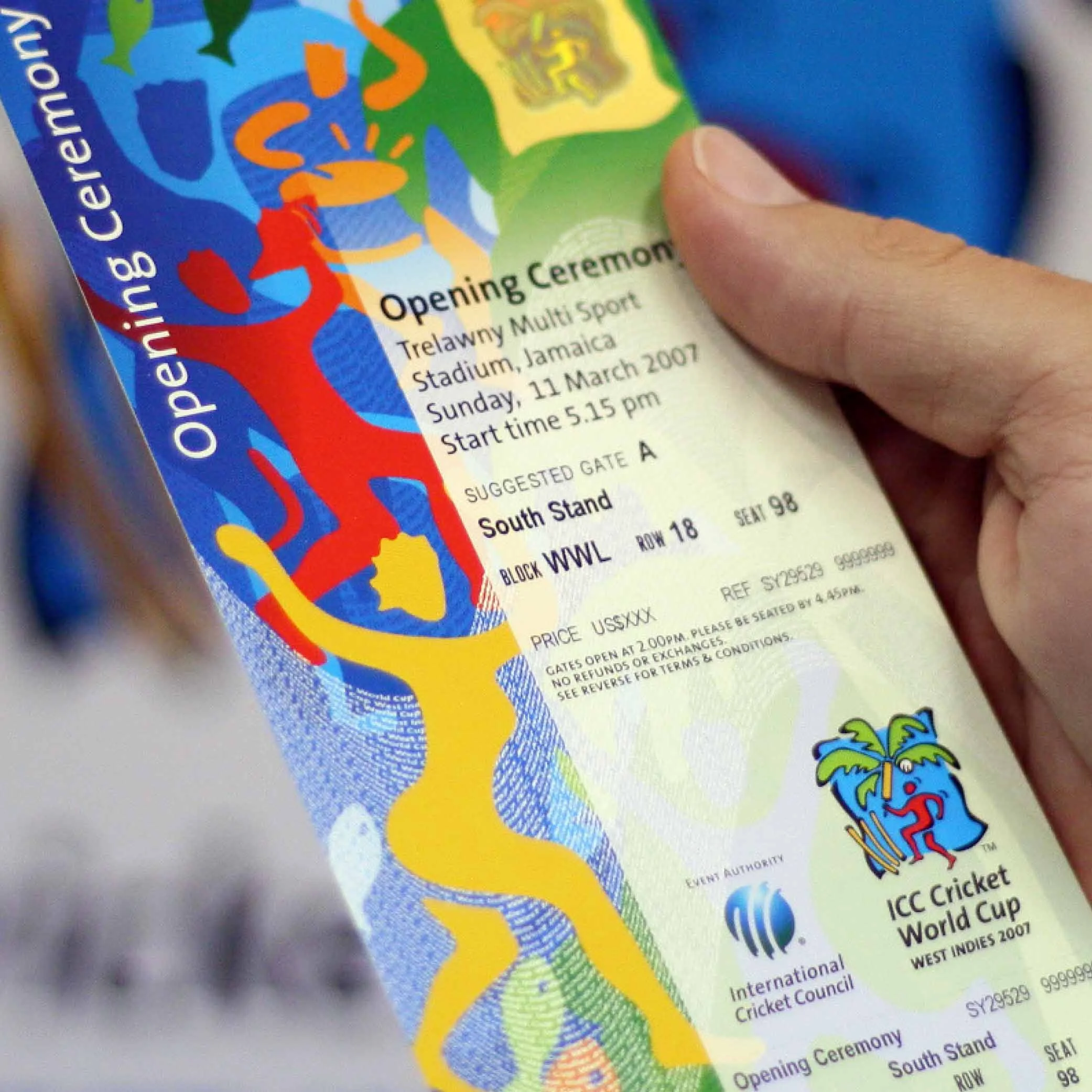
ICC/REBRAND
5
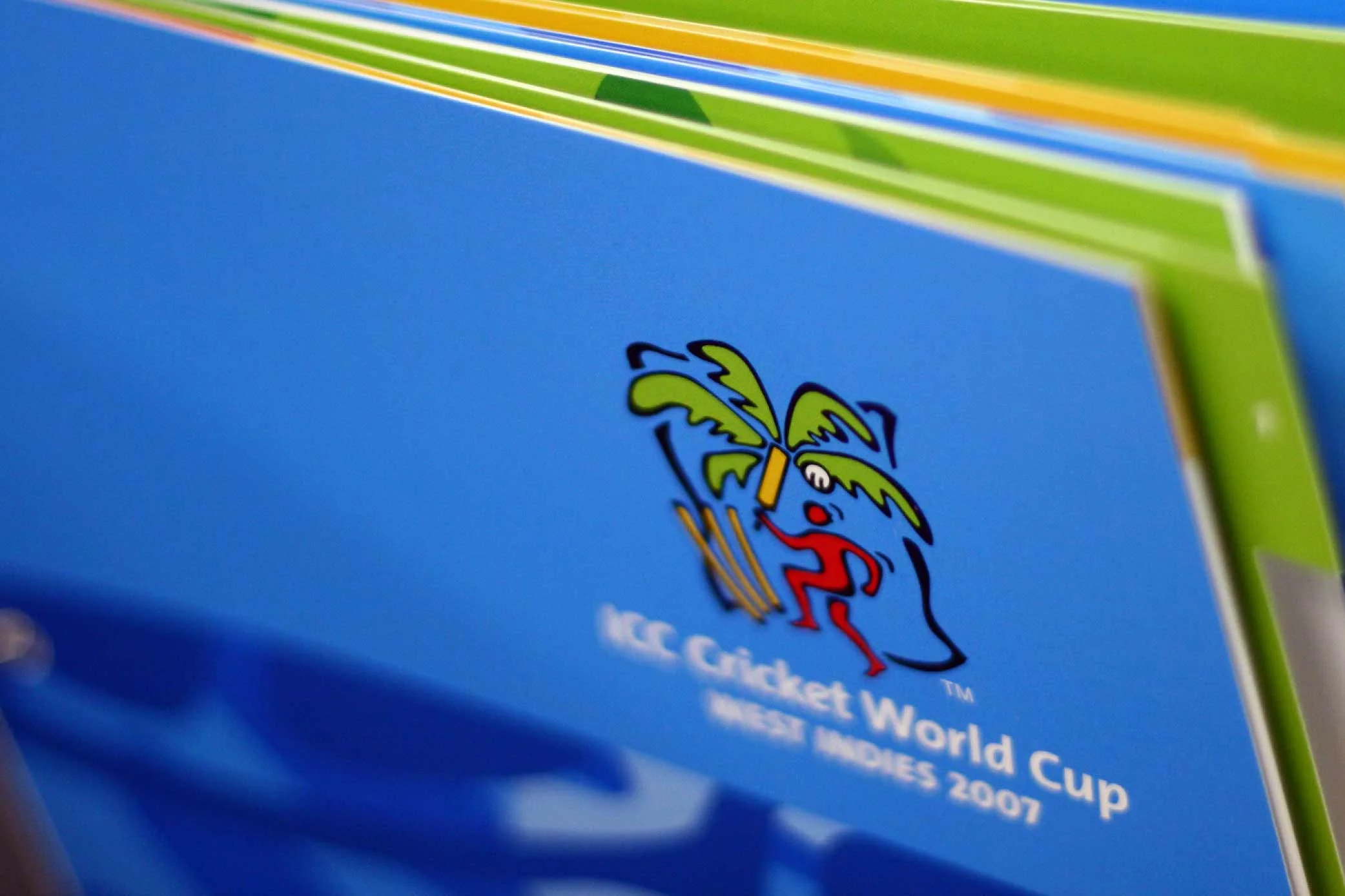
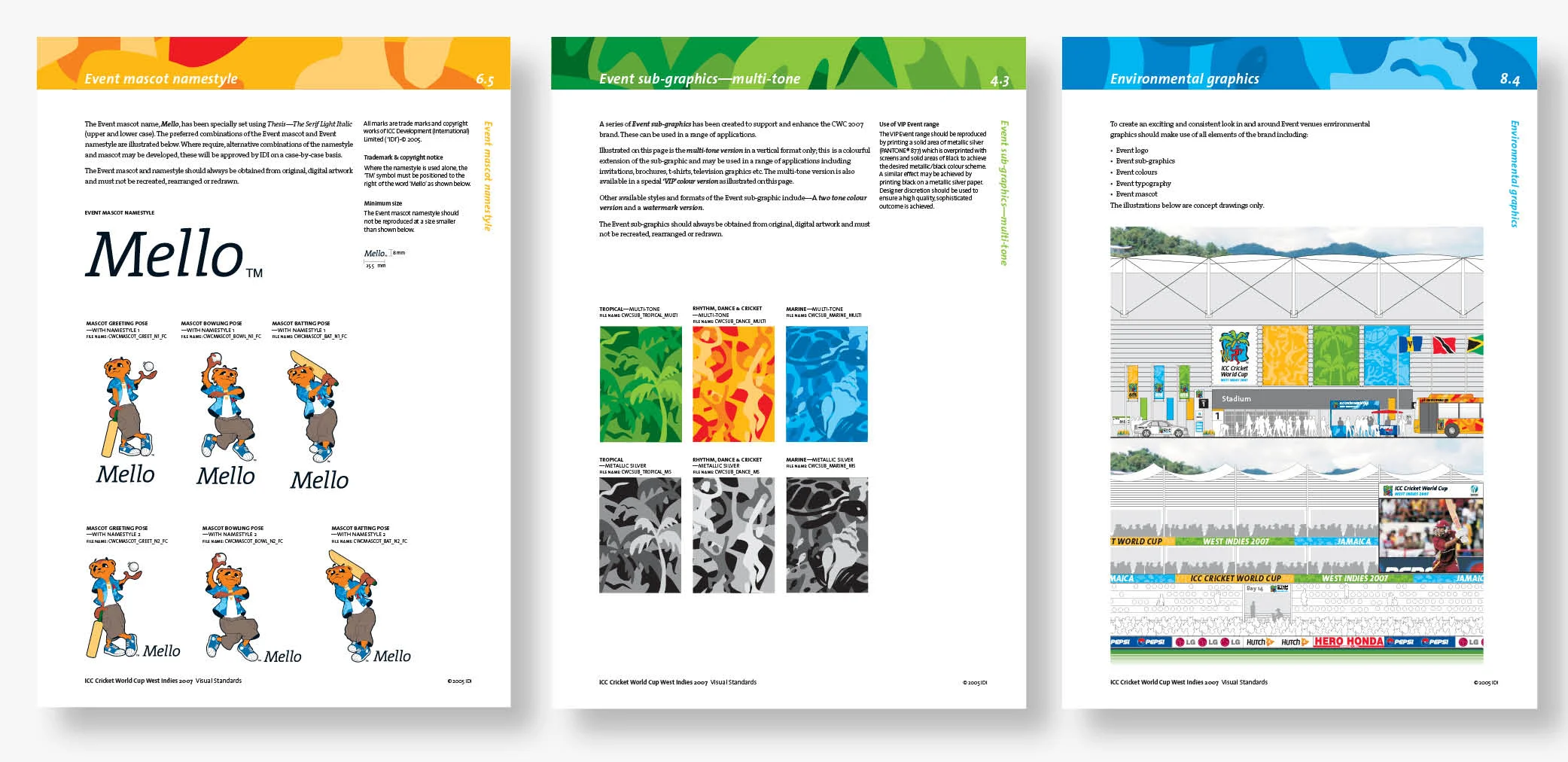
ICC CRICKET WORLD CUP 2007/BRAND

7
MANLY SAILING/IDENTITY

6
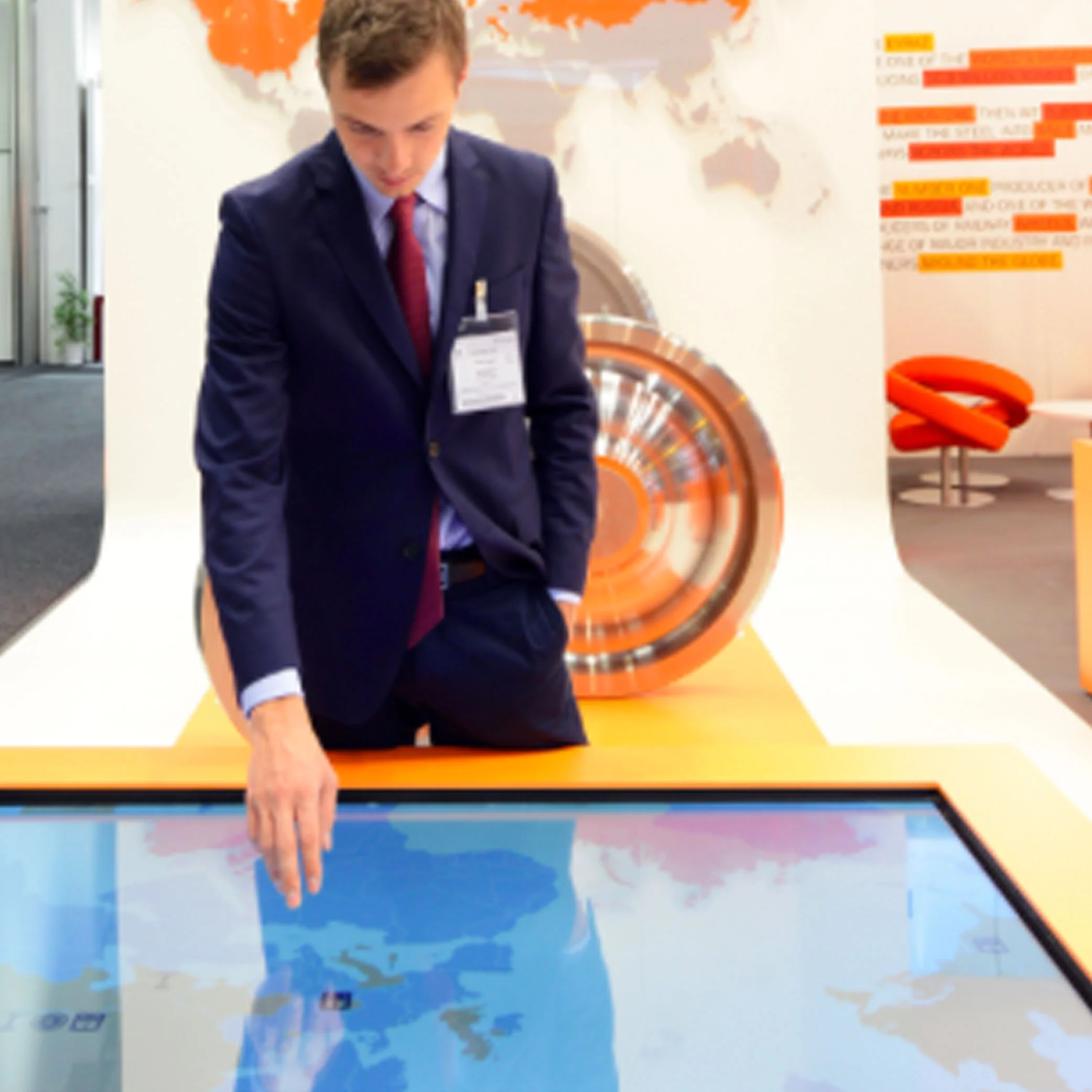
IOGP/REBRAND

2
SAUDI CEMENT/REBRAND

4
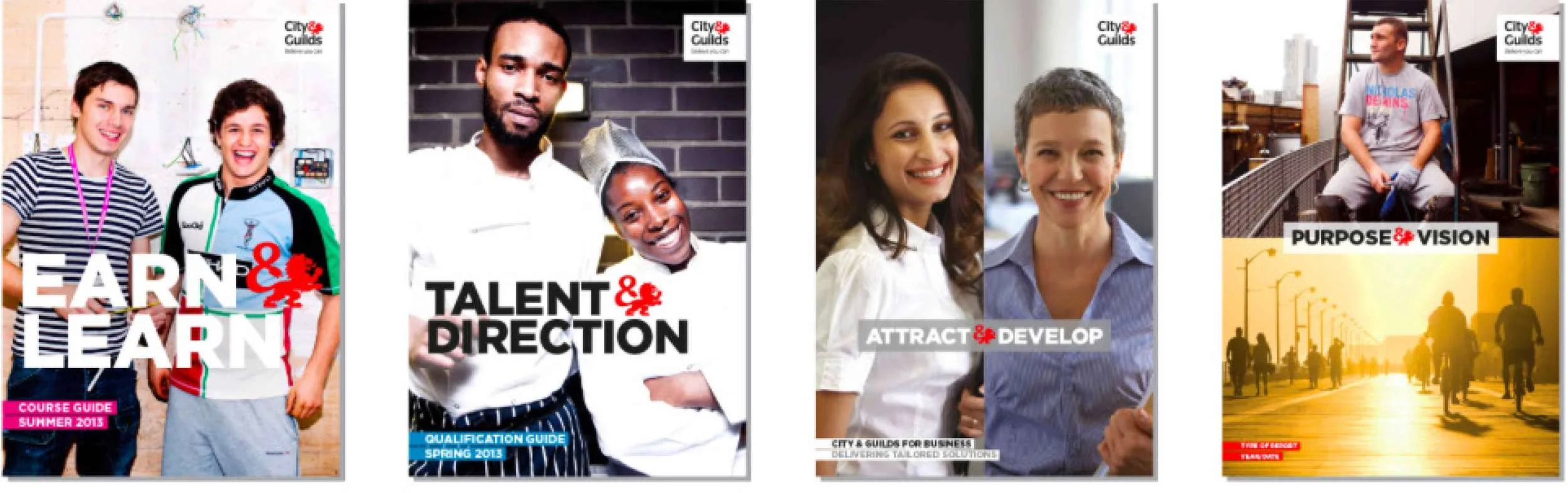
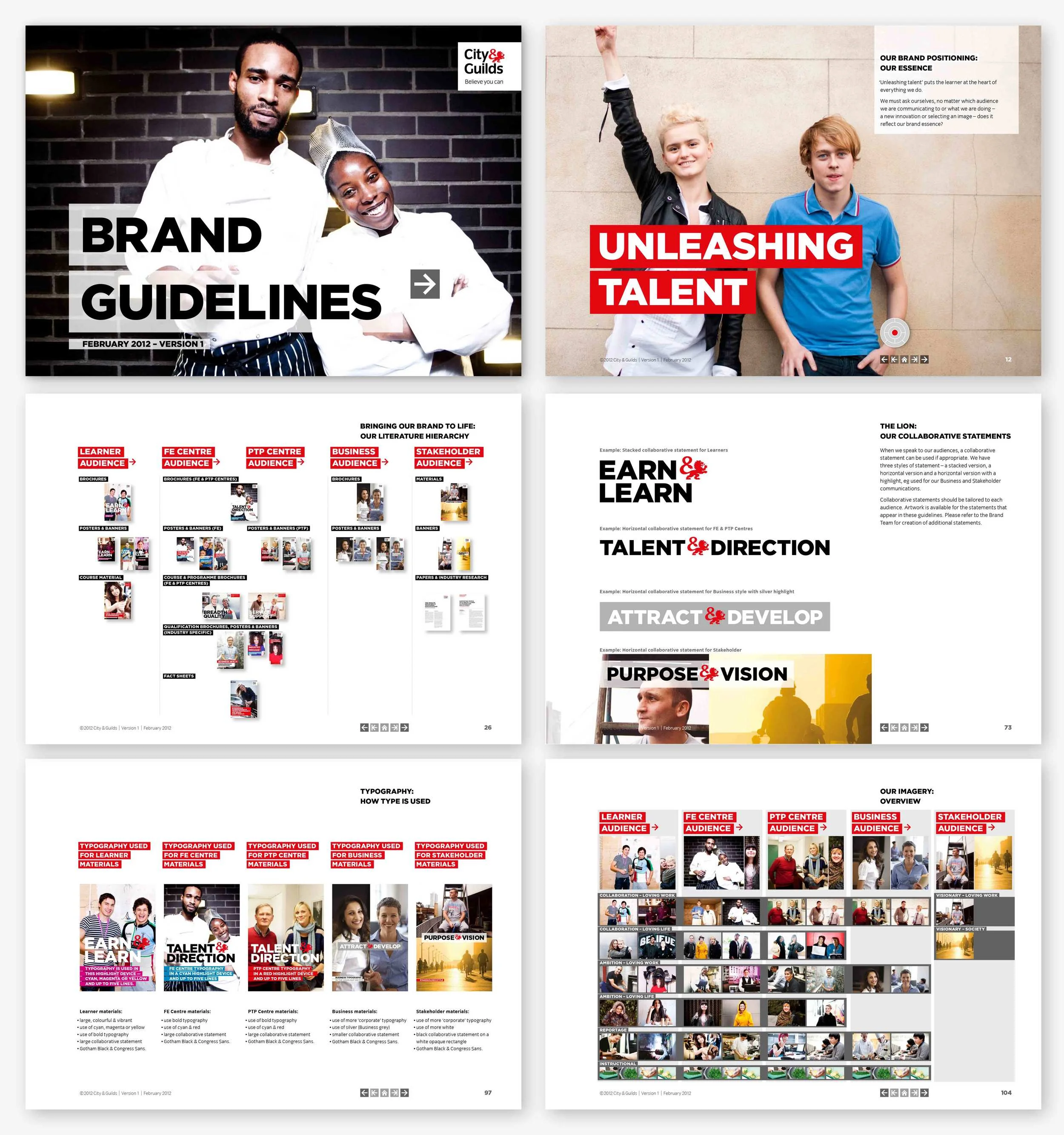
CITY & GUILDS/BRANDING
6
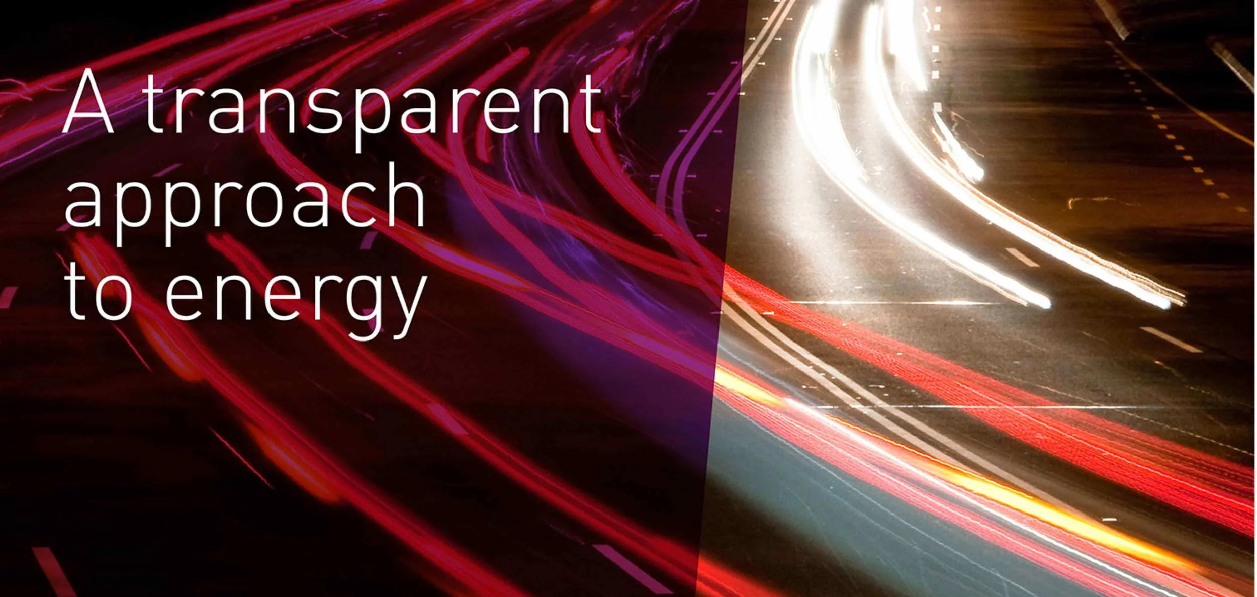
EVRAZ/CAMPAIGN BRAND

8
A BIOTECH CAMPAIGN/BRAND

3
GP4KIDS/IDENTITY

4
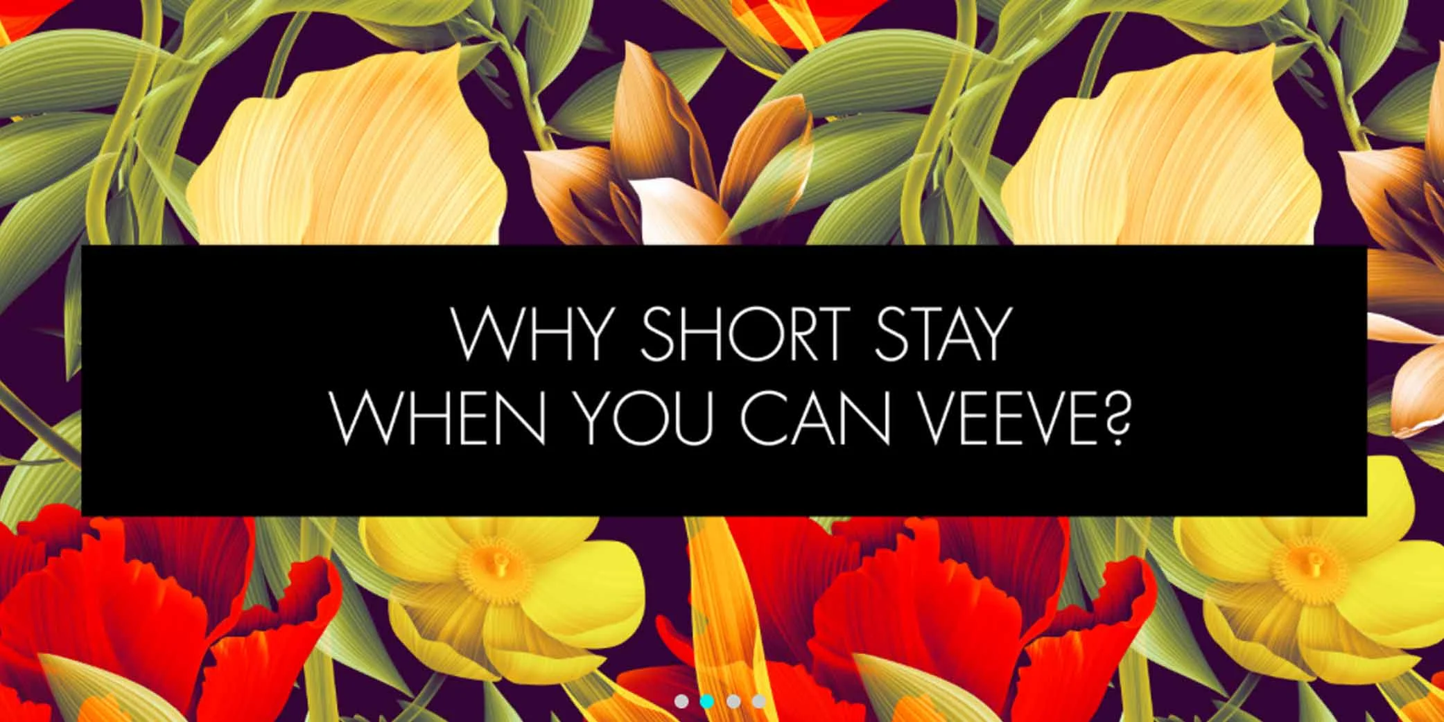
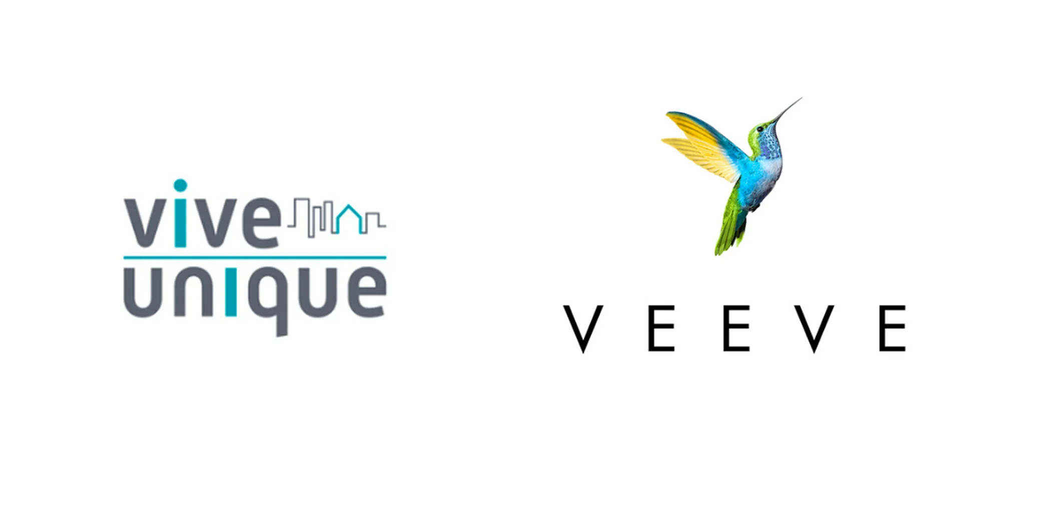
VEEVE/REBRAND