• HOME
  • ABOUT ME
    • YOGA
  • DESIGN
  • THINK
  • CONTACT
Menu

Michail Kowal

Inspiring creativity & zen
  • HOME
  • ABOUT ME
  • YOGA WITH MIKY
    • YOGA
  • DESIGN
  • THINK
  • CONTACT


WHAT MAKES A WINNING OLYMPIC BID LOGO?

February 25, 2016

WITH TALK OVER THE LAST WEEK ABOUT THE LAUNCH OF LOS ANGELES’ BID TO HOST THE OLYMPICS IN 2024—WHAT ARE THE CRITERIA FOR A WINNING BID LOGO?

Past winners

Let’s take a look at winning Olympic bid logos over past years and their accompanying Olympic emblems. 


*Note—the Tokyo 2020 logo was withdrawn in 2015 due to allegations of plagiarism. Bid logos for Barcelona, Seoul and LA were not available.

What are some of the criteria for an Olympic bid logo vs. an Olympic emblem?

An Olympic bid logo needs to: 

  • Be able to be trademarked
  • Be created within a limited bid budget and timeframe (remember this isn’t the real deal—win or no win—it will be thrown away eventually)
  • Engage business, government, sponsors to raise funds for the bid
  • Make a statement about the host city—an Olympic bid is surely an exercise in tourism and business, if nothing else
  • Excite the host city and country, and get everybody behind the bid
  • Appeal to IOC members
  • Not take away from the possibilities of what could be if the bid is successful 
  • Be a symbol of what the bid represents—the bit people passing judgement seem to forget, what is the brand beyond the logo? What does the bid stand for?

An Olympic emblem should: 

  • Be original—must be able to be trademarked in all markets
  • Ignite the imagination of the world—conjure up images in the mind of Olympic athleticism, the time and age, while reflecting on the character and heritage of the host city
  • Be able to be licensed/merchandised—people need to buy it, wear it, love it
  • Bring the brand to life
  • Work across every kind of imaginable medium
  • Last the test of time—an Olympic logo is launched years in advance of the actual event, it should build excitement in the lead up and during the event and become a symbol of legacy of the games

The pressure to meet these criteria is immense—the whole world is a critic. 

The 2024 contenders

Let’s take a look at the bid logos for 2024. 

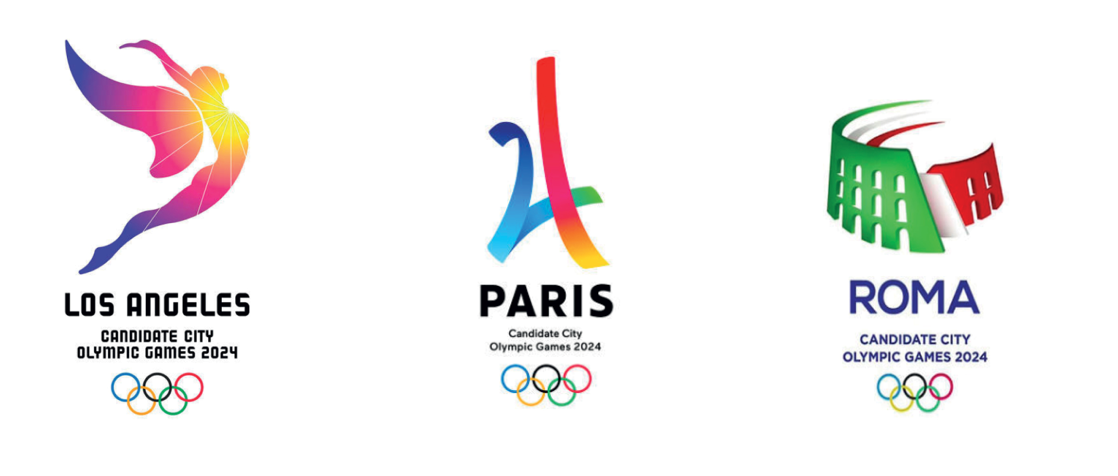
LA 2024—the glowing pink angel has a powerful story—’follow the sun’. It is energetic, different, enlightening, definitely a crowd pleaser. It raises interesting questions about design and style when compared to an earlier 2024 bid logo by RE: and M&C Saatchi —their well thought through system and reference to LA 1984 was, modern, energetic and powerful. Where did it fall down—was it a bit like London 2012’s controversial logo which was too different for the crowd to love it? 

Paris 2024—the colourful ribbons forming the Eiffel Tower are exactly what I’d expect from a candidate city bid logo—take a popular icon or land mark and wrap it in some dynamic marks. It does the job though. 

Rome 2024—takes another really obvious icon but sadly is devoid of bright colour, energy and excitement. A bit of a lack lustre approach and in my view doesn’t set the benchmark very high for what’s to come from Rome’s bid. 

What are your thoughts? How to you think these Olympic bid logos shape up to the criteria? Do you think these marks make a difference to the outcome of what is a politically driven process?  Do you think they are original? 

Originality and meeting the criteria

To create something that is original, and not just be liked, but loved by everyone—across cultures, time and place while representing the host city and the spirit of the games—is near impossible in this day and age. 

The controversial Tokyo 2020 emblem is an example of this—in September 2015 it was withdrawn due to allegations of plagiarism.  

The Tokyo 2020 emblem was withdrawn due to accusations that it plagiarised the Theatre De Liege logo


Anybody with experience in design of brand identity understands that similarities can and do occur. To think that a Japanese designer plagiarised the work of a Belgian designer’s logo for a theatre company is, in my view, beyond ridiculous. If you look at the simplicity of Japanese design and especially the Olympic logo of 1964—the original logo for Tokyo 2020 by Kenjiro Sano makes sense. Interestingly, the lawsuit against the Olympic committee has been withdrawn. I’m not saying whether I like or dislike Kenjiro’s logo and whether it meets all the criteria of the perfect Olympic emblem—but it makes sense. 

The most shocking outcome of the whole dilemma is that the The Tokyo Organising Committee succumbed to both public pressure and the lawsuit and didn’t stand behind the emblem that it launched—losing all credibility. They since put the design out to competition to all Japanese citizens and Nationals. In December 2015 they had received 14,599 entries. They’ve now narrowed it down to 4 and are going through the trademark process. I dread to think what the outcome might be like. I know for a fact I’m vehemently opposed to this approach—it undermines our collective experience and expertise—and wastes thousands of hours of many peoples time. New Zealand’s approach to the design of its flag is another example of a whole design and brand profession being devalued. Let’s look out for the outcome of both and revisit this argument. 

A winning Olympic bid logo and Olympic emblem can be nothing short of a streak of creative genius—to be truly original, meaningful and exciting while meeting the raft of criteria representing complex stakeholders, views, opinions and lastly the trademark lawyers. It takes guts and courage and I take my hat off to any one who steps up to the challenge past, present and future.


DOES HSBC UK’S NEW NAME AND HURRIED REBRAND SPELL RE-BLAND?

February 18, 2016

A rebrand is no small feat, with 950 branches across the UK, and a deadline of end 2017—this scale of change presents a tremendous opportunity to redefine the banking experience in the UK. Why is HSBC in such a rush to begin the roll out of the HSBC UK brand? Will they delight or disappoint?


HSBC is to ring fence its retail arm in the UK by 2019 to meet new laws. There has been much speculation about what this might look like for the brand and banking in the UK—a name change, a new brand, or even a new way to bank? 

A completely new name, the old name ‘Midlands Bank’, and online brand name ‘FirstDirect’ were all mooted, as staff and customer research and the value of the global brand informed a decision to simply rename as ‘HSBC UK’.  We all know brand is much more than a name—and imagine that HSBC will take this opportunity to redefine what HSBC and banking means in the UK. 

HSBC had originally planned to launch the rebrand in 2018—but has just announced it’s now launching its first new branch in Birmingham next month. 

The promise, and living up to the ambition

HSBC is a global brand—it’s hard to miss it wherever you go in the world. As an expat it was the only bank account I could get when I made the big move to London eight years ago. Of all the banks I know, HSBC’s campaigns are the ones that most clearly stick in my mind, I think because they are both provocative and ubiquitous. 

The brand promise ‘powering human ambition’ is powerful and emotional—it connects people to opportunities and helps them realise their ambition. It spawned the 2015 campaign by JWT and the rich print and digital campaign that tells the stories of human ambition. 

My question is this—does HSBC live up to this promise? 

Does HSBC help me realise my ambitions? My online experience is fine — in my view the smartphone app and website both work well. I should however buy shares in the bank—the fees and charges I pay are phenomenal. Then there the occasional visit to the brand—it’s a whole other kettle of fish—more akin to going to the post office or dentist. In brand experience terms it’s almost as bad as you can get. 

Most recently I walked into a branch to show identification for a new business account, I had to argue to convince the teller to take the information that the phone consultant had told me to provide. My next experience was to walk in to deposit cash—I had to find my way to a deposit machine, no human in sight to help me along the way or even say hello. 

Transforming what it means to be a bank

During my last trip to Australia, I needed to deposit some money to a friends bank account and found myself in CUA (Credit Union Australia, what is it with banks and acronyms? I walked into a bubbly bunch gathered around a table, for a minute I had to double take, was I in a bank? I thought I was in an Apple Store or cafe. Right there and then I deposited the cash, quickly and simply with a friendly chat—I felt good, like I’ve never felt in a bank before. Interesting their slogan is ‘Life Rich Banking’. 

credit_union_australia_exterior-565x359.jpg
0_420_560_0_70__Galleries_20120827032915_bank-branch-cua-5.jpg
0_420_560_0_70__Galleries_20120827033001_bank-branch-cua-10.jpg

The integrated marketing campaign for nab (National Australia Bank) won the Cannes Lions for its infamous break-up with the other big banks. The new slogan ‘more give, less take’  promised to change the way banking was done in Australia—sadly, nab has not delivered on the promise and ‘More take and less give’ has been suggested as a better slogan. A rebrand and successful campaign means nothing if the brand isn’t lived from the inside out—that includes changing the behaviours of the organisation to ensure that it meets its promise. 

8d7cdb5e-b6c6-11e2-b9ad-57998c3f42ed_519067208--646x363.jpg
contents_1602_1_1.jpg
a4f7fbd8-b6c6-11e2-b9ad-57998c3f42ed_519066951--646x363.jpg


What’s HSBC UK’s story? Are they testing the waters? Engaging their customers and their people on the journey?

The launch of the new HSBC UK brand in Birmingham signifies the beginning of the transformation. I’m of two minds whether it’s a good thing or a bad thing—it has the potential to be either. 

We know that: 

  • The name HSBC UK is definite
  • A strong global brand exists, with a promise to connect customers to opportunities and helping them realise their ambition throughout their life
  • The UK brand team knows its UK customers well 
  • The banking experience is ripe for redefinition

There are many questions, is Birmingham simply a test? A prototype? Allowing the brand team to build along the way. Or is the brand launch being rushed for other reasons? Is this going to be a missed opportunity to really get it right? What might HSBC UK learn from other recent brand launches?

airbnb_billboard_01-2000x1125.jpeg
uber.jpg

airbnb spent over a year getting their rebrand right before roll-out and they don’t have retail outlets. They went to great efforts to really understand the customer mindset and I believe have been successful on being a loved brand—of course this goes far beyond the logo—but every thing that the airbnb brand represents—it's real. The Uber rebrand on the other hand seemed to spring up out of nowhere—don't get me wrong I love the product—I'm a fan and use Uber all over the world—but my gut instinct is that this new, fussy brand is trying too hard. Has it been overthought? Over researched? Look out for my thoughts on this in another post.

Moving fast can create spontaneity and dynamism, reduce over research and over-testing and in turn produce something new and different. But in the end it comes back to brand being more than a name or a logo—the whole business needs to change it's mindset. When I walk into a branch, I want to want to go there—I want to see ambition on the face of the people that greet me—I want to really feel like my bank cares.

Is this rebrand ambitious? This is an opportunity to lead change. Time will tell as to whether HSBC UK can change both our perceptions and reality of banking—it would be nice to be able to one day say 'I love my bank' the way I might say I love Uber or airbnb.


I AM MICHAIL.

January 17, 2016

Today—I'm proud to share my work with you. Over twenty years I've been been fortunate to work on some incredible projects and I've had some of the best experiences of my life—moreover I am grateful to have worked with some very talented designers—you know who you are. Here is to many more design/branding/andevenbigger challenges across the globe in the future.